Secure Collaboration Platforms: Protecting Data in the Hybrid Work Era
February 13, 2026
Let's face it. User Experience (UX) design can often feel incredibly overwhelming. We are constantly striving to solve complex problems, meticulously balance diverse business goals, and thoughtfully design for users who possess unique ways of thinking, feeling, and behaving. However, amidst this intricate and often beautiful chaos, there exists an incredibly grounding and fundamental concept: UX heuristics. These aren't just arbitrary rules; they are the reliable rules of thumb, the steadfast guiding principles, and the essential mental checklists that empower us to create digital experiences that simply work seamlessly. Yet, despite their profound impact, these invaluable principles often remain quietly in the background, largely underappreciated.
This blog post aims to shine a much-deserved spotlight on these unsung heroes of design. We will thoroughly break down what UX heuristics truly are, delve into why they hold such significant importance, explore practical ways to effectively use them in your design workflow, and most importantly, reveal how embracing these principles can profoundly transform you into a better, more empathetic designer.
At their core, UX heuristics are fundamental usability principles that serve as a robust framework for effectively evaluating and continuously improving digital experiences. The most widely recognized and influential set of these principles comes from Jakob Nielsen’s seminal work, "10 Usability Heuristics for User Interface Design," first published in 1994. Remarkably, despite their age, these principles are more relevant and critical today than ever before in the rapidly evolving digital landscape.
You can think of them as your reliable mental compass in the vast ocean of design. They won't dictate the exact features or elements you need to build, but they will expertly guide your design thinking and help you skillfully identify potential "red flags" and usability issues long before your actual users encounter them. This proactive approach saves time, resources, and prevents user frustration.
In the fast-paced world of design, most teams are constantly strapped for time and resources. Not every project is afforded the luxury of weeks dedicated solely to extensive user testing. This is precisely where heuristics emerge as a true UX superpower, offering invaluable advantages that allow you to:
While heuristics are particularly powerful when thoughtfully paired with user research, they also serve as an excellent sanity check on their own. They serve as a constant, gentle reminder that at the heart of every digital interaction are real people, not just abstract users or robots, and our designs should reflect that human understanding.
Let's embark on a journey through each of Jakob Nielsen’s foundational principles, exploring them in a humanized, practical, and highly relatable way.
Users should always have a clear understanding of what is happening within the system at any given moment.
The system should speak the user’s language, using words, phrases, and concepts that are familiar and relevant to them, rather than technical jargon.
Users need a clear "emergency exit" to leave an unwanted state without extended dialogue. Supporting undo and redo actions is crucial.
Users should not have to wonder whether different words, situations, or actions mean the same thing. Follow platform conventions and internal consistency.
Even better than clear error messages is a careful design that prevents a problem from occurring in the first place.
Minimize the user’s memory load by making objects, actions, and options visible. The user should not have to remember information from one part of the dialogue to another.
Accelerators, like keyboard shortcuts, which are unseen by the novice user, may often speed up the interaction for the expert user such that the system can cater to both inexperienced and experienced users.
Dialogues should not contain information that is irrelevant or rarely needed. Every extra unit of information in a dialogue competes with the relevant units of information and diminishes their relative visibility.
Error messages should be expressed in plain language (no codes), precisely indicate the problem, and constructively suggest a solution.
Even though it is better if the system can be used without documentation, it may be necessary to provide help and documentation. Any such information should be easy to search, focused on the user’s task, list concrete steps to be carried out, and not be too large.
Let's imagine you are tasked with designing a new telehealth platform. Here's a practical demonstration of how Nielsen's heuristics can seamlessly guide your design thinking and decisions:
Suddenly, by applying these thoughtful principles, the entire telehealth experience transcends mere functionality. It feels intuitive, profoundly human, and inherently trustworthy, fostering a positive user journey.
Heuristics are not rigid, unbending rules; instead, they serve as powerful springboards for richer conversations and the creation of superior products. Integrating them into your design workflow can be incredibly beneficial:
Making heuristics a habitual part of your process will soon transform them from a mere checklist into an instinctive part of your design thinking.
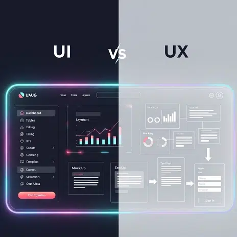
It's common to confuse these terms, so let's clarify their distinct roles:
Crucially, heuristics inform both design systems and platform-specific guidelines. They are the underlying, fundamental truths that guide the creation of consistent, user-friendly components and platform-appropriate experiences.
Embracing heuristics doesn't require a radical overhaul of your workflow. You can start small and integrate them incrementally:
As you consistently incorporate these principles into your daily practice, they will gradually cease to feel like a tedious checklist. Instead, they will evolve into an intuitive second nature, seamlessly integrating into your design instincts.
UX heuristics are far from being mere fancy buzzwords or outdated theories. They represent timeless, fundamental truths about human behavior and interaction with digital systems. In an era characterized by the rapid advancement of AI, the emergence of no-code tools, and the increasing complexity of digital systems, their relevance has not diminished; in fact, it has only grown stronger.
Ultimately, heuristics ensure that we don't just design quickly, but that we design right. So, the next time you find yourself pondering a design decision or facing a challenge, take a moment to ask yourself these essential questions:
Because, at the end of the day, truly great UX isn't about achieving unattainable perfection. It's about meticulously crafting an experience that feels so natural and intuitive that people don’t have to pause and think twice about how to use it. And that, unequivocally, is the real magic and enduring power of heuristics.
At Qodequay, we deeply understand that exceptional digital experiences are built on a foundation of human-centered design principles. Our unique methodology, rooted in design thinking, seamlessly integrates the power of UX heuristics with cutting-edge technologies like Web3, AI, and Mixed Reality. We don't just build solutions; we engineer transformative digital ecosystems that are inherently intuitive, scalable, and deeply user-centric. By meticulously applying heuristic evaluations and robust user research, we ensure that every solution we craft simplifies complexity, fosters trust, and delivers unparalleled value to the end-user. This approach empowers organizations to navigate their digital transformation journeys with confidence, knowing their solutions are built for true human connection and optimal performance.
Are you ready to transcend traditional digital boundaries and embrace a future where your digital solutions are not just functional but truly intuitive and impactful? Partnering with Qodequay.com means gaining a strategic advantage through collaboration with our seasoned experts. We specialize in solving your most complex business challenges by leveraging a holistic approach that blends proven UX heuristics with pioneering technological advancements. Our commitment is to help you future-proof your operations, drive sustainable innovation, and achieve superior user-centric outcomes that resonate deeply with your audience.
Discover how Qodequay's design thinking-led approach and expertise can elevate your next project.
Visit Qodequay.com today to explore our services or contact us to schedule a consultation. Let's create something extraordinary together!
At Qodequay, we believe that meaningful innovation starts with understanding people. As a design-first company, we lead with deep empathy—immersing ourselves in the everyday realities, behaviors, and desires of your customers.
Only after decoding real-world pain points do we bring in technology as the enabler. This ensures every solution we build is not just technically sound, but intuitively aligned with human needs.
Whether it's:
We design with purpose, and build with precision.
As the CEO and Founder of Qodequay Technologies, I bring over 20 years of expertise in design thinking, consulting, and digital transformation. Our mission is to merge cutting-edge technologies like AI, Metaverse, AR/VR/MR, and Blockchain with human-centered design, serving global enterprises across the USA, Europe, India, and Australia. I specialize in creating impactful digital solutions, mentoring emerging designers, and leveraging data science to empower underserved communities in rural India. With a credential in Human-Centered Design and extensive experience in guiding product innovation, I’m dedicated to revolutionizing the digital landscape with visionary solutions.
Follow the expert :

February 13, 2026

February 13, 2026

February 13, 2026

February 13, 2026

February 13, 2026