Secure Collaboration Platforms: Protecting Data in the Hybrid Work Era
February 13, 2026
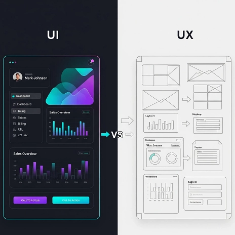
Have you ever encountered a stunning app that left you utterly confused, or perhaps a rather plain one that was surprisingly effective? This familiar dilemma highlights the ongoing tension between User Interface (UI), which focuses on visual aesthetics, and User Experience (UX), which prioritizes functional flow. While the design maxim "form follows function" holds true, for users, the distinction between beauty and usability often. The reality is, the most exceptional digital products don't force a choice; instead, they seamlessly merge beauty and usability, allowing users to simply experience a delightful and effortless flow.
In this exploration, we will delve into how UI and UX can work in concert, rather than as adversaries. We will examine the pitfalls of overemphasizing one at the expense of the other and discover how achieving the right UI UX balance leads to products that are both captivating and reliable.
It is a fundamental aspect of human psychology: we are inherently predisposed to trust what looks good. Clean layouts instinctively convey professionalism, smooth animations suggest technical sophistication, and a modern appearance often leads us to believe a product will perform better. This phenomenon is widely recognized as the "Aesthetic-Usability Effect." Essentially, if something looks appealing, people tend to assume it functions well.
However, a crucial point to remember is that if the UI's visual promise isn't fulfilled by the actual user experience, a sense of betrayal can set in. Visuals create the first impression, but the long-term impression is undeniably shaped by the overall experience. Therefore, designers bear the crucial responsibility of honoring both aspects.
Let us consider a few examples where an overemphasis on UI led to significant user dissatisfaction.
Snapchat's 2018 redesign is a classic cautionary tale. While the UI was bold, sleek, and minimalist, the UX proved to be incredibly confusing. Users struggled to locate their friends' stories, as the redesign prioritized visual hierarchy over intuitive navigation. The outcome was a strong backlash, with 1.2 million users signing a petition to revert the changes. This demonstrates that an aesthetically pleasing interface can fail spectacularly if it doesn't support how people naturally think and interact with a product.
Many art portfolio websites boast stunning layouts with full-screen images and minimalist text, often at the expense of usability. While visually eye-catching and bold, these sites frequently suffer from hidden navigation, poor accessibility, and inconsistent behavior. The designers created something beautiful but overlooked the fundamental need for it to be usable.
Key Takeaway: A design may appear innovative, yet it can ultimately fail if it does not effectively support the actual thought processes and behaviors of its users.
Conversely, what happens when a robust UX is buried beneath a lackluster UI? Users often become disengaged.
Many government or legacy enterprise systems are designed with strong UX principles in mind, focusing on data entry, logical flows, and user roles. However, their UI frequently consists of unstyled buttons, poor contrast, and a complete absence of visual hierarchy. While the user experience may be technically functional, it often feels tedious and uninviting.
Some wellness tools offer deeply personalized journeys and timely reminders based on user behavior. Despite their intelligent UX, they sometimes feature clinical interfaces with bland fonts and uninspiring visuals. This lack of warmth and visual invitation can lead to users dropping off, not because of a flawed UX, but due to a missing emotional connection facilitated by the UI.
Key Takeaway: Even the most meticulously designed UX requires a compelling UI to make the experience enjoyable and genuinely human.
Fortunately, many products successfully integrate UI and UX, demonstrating true design harmony.
Apple's operating systems, macOS and iOS, exemplify this balance. Their UI is characterized by precision, subtle gradients, intuitive gestures, and consistent spacing. This visual refinement seamlessly integrates with a UX that offers seamless handoffs, intuitive flows, and instant feedback through micro-moments. Every interaction feels thoughtfully crafted and alive.
Notion offers a testament to this balance. Its UI is minimalist, modular, and brand-neutral, providing a clean canvas. This aesthetic perfectly complements its UX, which allows for drag-and-drop ease, flexible block structures, and unprecedented user freedom. Users can mold Notion to their specific needs without ever feeling visually overwhelmed.
The Stripe Dashboard provides another excellent example. Its UI features sharp contrast, slick typography, and a calm color palette. This design choice supports a UX focused on data-rich layouts, clear hierarchy, and robust interactivity without unnecessary bloat. The result is a platform that makes complex financial operations feel remarkably straightforward.
These examples clearly illustrate that the most successful companies do not prioritize one aspect over the other. Instead, they achieve a perfect synergy between aesthetic polish and UX clarity.
Achieving a harmonious UI UX balance isn't about magic; it's about a well-defined method. Here is how leading design teams accomplish this:
The User Experience (UX) should always lead the design process. Begin by thoroughly understanding:
However, it is crucial to bring UI considerations into these discussions early on. Allow UI to influence:
Effective UI goes beyond mere aesthetics; it actively supports user comprehension. Instead of relying on lengthy instructions, consider using iconography. Leverage color hierarchy to subtly guide a user's attention. Break down large, complex tasks into smaller, visually segmented chunks. Great UI does not just look appealing; it actively facilitates clearer thinking and easier interaction.
Microinteractions are tiny, subtle UI details that significantly enhance the overall UX. These include:
These small but impactful details create rhythm, predictability, and genuine delight. They are the precise points where UI and UX truly intertwine and reinforce each other.
When conducting usability tests, it is essential to look beyond just task completion. While it is important to ask, "Could the user complete the task?", also delve into the emotional aspects:
By incorporating emotional responses into your metrics, you gain a more holistic understanding of the user's journey.
When UI and UX are perfectly aligned, the design itself often goes unnoticed by the user. Instead, they simply feel, "this is easy." They sense, "this feels made for me." They are not distracted by inconsistent spacing or mismatched buttons. There is no confusion about their current location within the interface or their next steps.
The most effective design is often invisible, not because it is overly minimal, but because it is remarkably cohesive. UI and UX should narrate the same story, speaking a unified language, rather than disjointed dialects.
Design systems serve as the foundational glue that maintains harmony between UI and UX. A robust design system typically includes:
Design systems are crucial for preventing fragmentation. They diligently preserve alignment, facilitate consistency at scale, and empower design and development teams to make faster, more informed decisions. A well-implemented design system functions much like the healthy connection between the brain and body: when in sync, every part of the product moves with deliberate purpose and efficiency.
It's common for designers to become deeply attached to a particular visual style, a clever navigation concept, or a bold layout. However, a crucial question must always be asked: Does this aesthetic choice confuse, delay, or alienate the user? If the answer is yes, then it is imperative to let go of that attachment.
The user, ultimately, does not care about your intricate grid system or your sophisticated color theory. Their primary concerns are:
The fundamental purpose of both UI and UX is not to impress but to serve the user. This unwavering focus on service is precisely how genuine user loyalty is earned and sustained.
You absolutely do not need to sacrifice one for the other. Think of it this way: allow UX to define the skeleton; the underlying logic, the natural movement, and the robust structure of your product. Then, let UI wrap it in the skin that expresses its unique tone, meticulous care, and emotional resonance.
Together, UI and UX collaborate to create a vibrant, living organism that feels:
When UI UX balance finds its perfect equilibrium, your product transcends mere functionality. It actively speaks to, guides, engages, and connects with its users. This is the profound difference between a mere tool and a truly transformative experience.
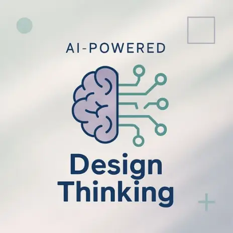
At Qodequay, we deeply understand the delicate UI UX balance between compelling UI and intuitive UX. Our design thinking-led methodology, combined with our unparalleled expertise in cutting-edge technologies like Web3, AI, and Mixed Reality, allows us to create digital products that are not only aesthetically brilliant but also functionally superior. We empower organizations to navigate their digital transformation journeys by focusing on scalability and delivering truly user-centric outcomes. Our approach ensures that every solution we craft is designed to delight users while seamlessly addressing complex business challenges.
Partnering with Qodequay.com offers businesses a distinct strategic advantage in solving complex challenges through innovative digital solutions. Our team of experts collaborates closely with you to understand your unique needs and future-proof your operations. By leveraging our deep industry knowledge and technical prowess, we help drive innovation, optimize processes, and ensure your digital products resonate deeply with your target audience. Choose Qodequay to transform your vision into an impactful reality.
Are you looking to create a digital product that truly stands out, blending stunning aesthetics with flawless functionality? Visit Qodequay.com today to learn how our design and technology expertise can help you achieve your goals. Contact us to discuss your project and discover how we can build an exceptional experience together!
At Qodequay, we believe that meaningful innovation starts with understanding people. As a design-first company, we lead with deep empathy—immersing ourselves in the everyday realities, behaviors, and desires of your customers.
Only after decoding real-world pain points do we bring in technology as the enabler. This ensures every solution we build is not just technically sound, but intuitively aligned with human needs.
Whether it's:
We design with purpose, and build with precision.
As the CEO and Founder of Qodequay Technologies, I bring over 20 years of expertise in design thinking, consulting, and digital transformation. Our mission is to merge cutting-edge technologies like AI, Metaverse, AR/VR/MR, and Blockchain with human-centered design, serving global enterprises across the USA, Europe, India, and Australia. I specialize in creating impactful digital solutions, mentoring emerging designers, and leveraging data science to empower underserved communities in rural India. With a credential in Human-Centered Design and extensive experience in guiding product innovation, I’m dedicated to revolutionizing the digital landscape with visionary solutions.
Follow the expert :

February 13, 2026

February 13, 2026
February 13, 2026

February 13, 2026

February 13, 2026