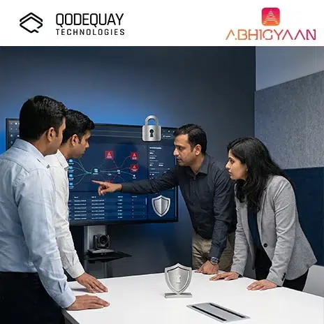
DPDPA Penalties Up to ₹250 Crore: The Real Cost of Waiting
July 2, 2026
You manage or build enterprise dashboards where users spend hours sifting through complex data. In such environments, design directly impacts productivity, focus, and even physical comfort. Dark mode has become popular not just as an aesthetic choice but as a practical one, especially in data-heavy dashboards where visual clarity and reduced eye strain are crucial. For CTOs, Product Managers, Startup Founders, and Digital Leaders, understanding dark mode design principles ensures your dashboards are not just trendy, but genuinely usable and effective.
Dark mode design is a UI approach that uses dark backgrounds with lighter text and accents. For data-heavy dashboards, it matters because it improves contrast, reduces glare, and helps users process complex visuals without fatigue.
Think of financial traders monitoring multiple dashboards for hours. A well-designed dark mode reduces strain while keeping key metrics visually distinct. Poorly executed dark mode, however, can invert colors carelessly and make data harder to interpret.
You ensure accessibility and readability by carefully balancing contrast levels.
Avoid pure black (#000000) backgrounds, which create harsh contrasts. Instead, use dark grays or navy tones. For text, avoid pure white (#FFFFFF), as it causes visual vibrations against dark backgrounds. Off-whites and light grays are more comfortable.
Use vibrant accent colors sparingly to highlight key metrics. For example, a stock trading dashboard might use muted tones for background data and bright green/red for gains and losses.
Typography should be optimized for readability without creating glare.
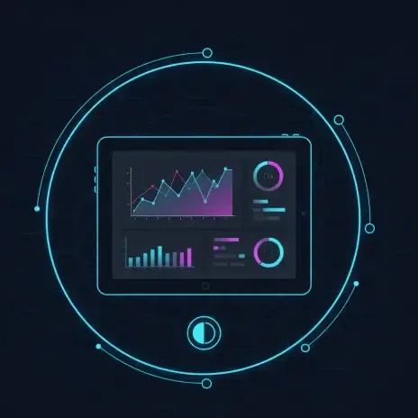
A dashboard showing IoT sensor data across hundreds of points will remain usable only if text remains legible under low-light conditions.
Color palettes must be adapted to prevent misinterpretation in dark mode.
Bright colors appear more saturated on dark backgrounds, so adjust hues accordingly. Use a smaller set of accent colors for charts and graphs to avoid overwhelming the eye.
For example, Google Analytics’ dark theme uses teal, orange, and blue as accent colors while keeping secondary data muted. This allows users to quickly distinguish important data trends.
You prevent eye strain by designing with balance, not just darkness.
Studies show that adaptive themes can reduce perceived eye strain by up to 20% for users in low-light environments.
A real-world example: some early healthcare dashboards adopted dark mode without testing legibility, leading to misread patient data and workflow inefficiencies.
The future lies in adaptive, context-aware themes. Dashboards will automatically adjust brightness and color balance based on ambient lighting, device type, and user preference.
AI-driven personalization could also allow dashboards to emphasize the most important data visually, adapting color contrast dynamically. For instance, predictive analytics dashboards may highlight anomalies with shifting color cues optimized for dark mode.
You are designing more than just dashboards—you are shaping how humans interact with complex data for hours at a stretch. Dark mode, when applied thoughtfully, transforms dashboards into powerful, ergonomic, and aesthetically pleasing tools.
At Qodequay, we put design first, ensuring that dark mode is not just a theme toggle, but a deliberate design choice that improves usability, accuracy, and adoption. With technology as the enabler and design as the foundation, we create dashboards that empower users to see data clearly, no matter how dark the interface may be.
As the CEO and Founder of Qodequay Technologies, I bring over 20 years of expertise in design thinking, consulting, and digital transformation. Our mission is to merge cutting-edge technologies like AI, Metaverse, AR/VR/MR, and Blockchain with human-centered design, serving global enterprises across the USA, Europe, India, and Australia. I specialize in creating impactful digital solutions, mentoring emerging designers, and leveraging data science to empower underserved communities in rural India. With a credential in Human-Centered Design and extensive experience in guiding product innovation, I’m dedicated to revolutionizing the digital landscape with visionary solutions.
Follow the expert :

July 2, 2026

July 2, 2026
July 2, 2026
July 2, 2026

July 2, 2026
Monthly insights on AI, VR and DPDPA compliance — straight from our team to your inbox.
Free 30-minute consultation with our team — or see our products in action.